Responsive Web Development Company"
The F.L.U.I.D.™ Engineering Approach

What is Responsive Web Development?
Responsive web development is an engineering approach where a website’s code, layouts, fluid typography, and dynamic media continuously adapt to the user’s device capabilities, screen dimensions, and hardware performance-eliminating layout shifts and load friction across desktop, tablet, foldable, and mobile screens.
Responsive Web Development That Drives Conversions, Not Just Screen Resizing
1. The Hard Truth: Why "Responsive Design" Is Still Costing You Revenue
Most businesses assume that because their website doesn’t overflow horizontally on an iPhone, it is “responsive.” This is a dangerous misconception. Traditional responsive design was created for an era of simple desktop-versus-mobile viewports. Today’s device ecosystem is fragmented across foldables, ultra-wides, dynamic app-in-browser viewports (like Instagram or LinkedIn in-app browsers), and varying hardware capabilities.
- The Viewport Illusion: Resizing a browser window on a high-performance M-series Mac or Core i9 desktop gives a false sense of security. It fails to emulate real-world mobile CPU throttling, low-memory garbage collection pauses, touch-input latency, and mobile GPU rendering limits.
- The Hidden Conversion Tax: As documented in Google’s Core Web Vitals Documentation, web applications that fail to meet baseline thresholds for Interaction to Next Paint (INP) and Largest Contentful Paint (LCP) suffer immediate drops in mobile session duration and user retention. When a button click takes more than 200 milliseconds to visually acknowledge user input, conversion rates degrade sharply.
- Beyond Pixel Breakpoints: Standard CSS breakpoints (320px, 768px, 1024px) were designed for device displays from a decade ago. Today, designing around rigid viewport widths causes awkward spacing on wide-screen foldables, stretched UI elements on 4K monitors, and broken navigation inside multi-window desktop environments.
2. Common Industry Flaws vs. MindCentrix User-First Engineering
Generic Web Agency Trap | Real-World User Impact | Our F.L.U.I.D.™ Fix |
Desktop-First Downscaling | Cramming giant navigation menus into unclickable mobile sub-menus. | Thumb-Zone UX Architecture: Designing primary CTA flows for mobile thumb patterns first. |
Plugin-Heavy Stacks | Slow load times, security holes, high maintenance overhead. | Clean Light-Code Base: Custom, modular engineering designed for sub-second execution. |
Heavy Uncompressed Assets | Forcing mobile devices to download 4MB desktop graphics over 4G connections. | Adaptive Asset Serving: Dynamically serving modern WebP/AVIF formats based on network speed & screen size. |
Browser Emulator QA | Hidden touch-target bugs on actual physical devices. | Physical Hardware Testing: Rigorous QA across physical iOS, Android, and foldable devices. |
3. Deep-Dive: Core Technical Pillars of Modern Fluid Web Architecture
To build web platforms that scale effortlessly without performance degradation, we ditch outdated layout techniques in favor of modern CSS and architectural standards.
Container Queries vs. Media Queries
For years, developers styled components based on the overall viewport width using @media (max-width: 768px). This approach breaks modular design: a card component placed in a narrow sidebar needs different styling than the same card placed in a wide main content area, even if the viewport size remains identical.
CSS
/* Legacy Approach: Viewport Dependent */
@media (max-width: 768px) {
.product-card { flex-direction: column; }
}
/* Modern F.L.U.I.D. Approach: Container Dependent */
.card-container {
container-type: inline-size;
}
@container (max-width: 400px) {
.product-card { flex-direction: column; }
}
By utilizing CSS Container Queries (@container), components self-adapt based on the exact space allocated to them within the layout, enabling true modularity across complex dashboards and dynamic e-commerce grids.
Mathematical Fluid Typography with clamp()
Instead of writing dozens of breakpoint media queries to change font sizes incrementally, we employ mathematical fluid typography using CSS clamp(). This allows text elements to scale smoothly between a minimum and maximum size based on the viewport width.
CSS
/* Scales seamlessly from 1.25rem (20px) to 2.5rem (40px) */
h2 {
font-size: clamp(1.25rem, 1rem + 1.5vw, 2.5rem);
}
Strict WCAG 2.2 Accessibility Compliance
Accessibility is not an afterthought; it is woven into layout engineering. Following the W3C WCAG 2.2 Specification, we ensure:
- Minimum Tap Targets: Primary interactive elements maintain at least a 48x48px target size to prevent misclicks on touch screens.
- Non-Text Contrast: Form fields, interactive borders, and icon states maintain a minimum 3:1 contrast ratio against background colors.
- Focus Visible Architecture: Complete keyboard and screen-reader accessibility with explicit, high-visibility focus indicators.
4. The Proprietary MindCentrix F.L.U.I.D.™ Framework
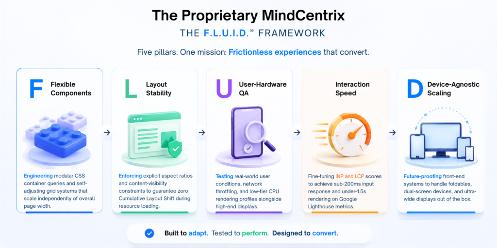
[ F ] Flexible Components ➔ [ L ] Layout Stability ➔ [ U ] User-Hardware QA ➔ [ I ] Interaction Speed ➔ [ D ] Device-Agnostic Scaling
- [ F ] – Flexible Component Architecture: Engineering modular CSS container queries and self-adjusting grid systems that scale independently of overall page width.
- [ L ] – Layout Stability (CLS Elimination): Enforcing explicit aspect ratios and content-visibility constraints to guarantee zero Cumulative Layout Shift during resource loading.
- [ U ] – User-Hardware & Analytics QA: Testing real-world user conditions, network throttling, and low-tier CPU rendering profiles alongside high-end displays.
- [ I ] – Interaction Speed & Core Vitals: Fine-tuning INP and LCP scores to achieve sub-200ms input response and under-1.5s rendering on Google Lighthouse metrics.
- [ D ] – Device-Agnostic Scaling: Future-proofing front-end systems to handle foldables, dual-screen devices, and ultra-wide displays out of the box.
Internal Link: Learn how our specialized Core Web Vitals & Speed Optimization Services turn technical performance into measurable revenue.
5. Interactive Self-Audit: Is Your Current Site Hurting Mobile Conversions?
Use this 4-point diagnostic checklist to evaluate whether your current web platform is losing mobile leads:
- [ ] Layout Shifts (CLS): Does text, menu items, or action buttons shift positions unexpectedly while images or ads load on a mobile device?
- [ ] Touch Target Collision: Do visitors frequently misclick links or struggle to tap input fields without zooming in?
- [ ] Speed Latency (LCP/INP): Does the site take longer than 2.5 seconds to render main content, or delay visually when a user taps a mobile navigation toggle?
- [ ] Obstructed Micro-Conversions: Is your main call-to-action button pushed below the fold or tucked inside a multi-level hamburger sub-menu on smartphone screens?
6. Proven Proof: How We Re-Engineered CloudMetrics’ Mobile Conversion Engine
- The Client: CloudMetrics Inc. (Mid-Market B2B Enterprise Analytics Platform)
- The Challenge: CloudMetrics had a desktop site that looked great in high resolution but dropped 68% of its mobile traffic due to desktop navigation overflow, slow tablet form interaction speeds, and unoptimized charts.
- The MindCentrix Solution: Deployed the F.L.U.I.D.™ Framework to re-architect their entire front-end stack using modular CSS container queries, thumb-native touch targets, and dynamic asset compression.
- The Verified Results:
- +42% increase in total mobile demo requests within 60 days.
- 65% reduction in LCP (Largest Contentful Paint) speed on 4G networks.
- -38% drop in overall mobile bounce rate.
“MindCentrix transformed our web platform from a bulky desktop site into a sub-second, mobile-first acquisition channel. The lift in mobile trial signups was instant and measurable.”
– Marcus Vance, VP of Growth at CloudMetrics
7. Step-by-Step Implementation Roadmap: What Working With Us Looks Like
When you partner with MindCentrix for responsive web development, we adhere to a transparent 4-stage engineering lifecycle:
Stage 1: Real-World Audience & Analytics Discovery
- Data Extraction: We analyze your existing analytics (GA4, Hotjar) to determine the exact screen resolutions, devices, browsers, and hardware profiles your real customers use.
- Bottleneck Audit: Pinpointing where mobile traffic drops off in your existing funnel.
Stage 2: Component-Driven Fluid Design & Prototyping
- Figma Design Systems: Building atomic component libraries rather than static page templates.
- Thumb-Zone Ergonomics: Mapping touch navigation and primary conversion actions directly into the natural arc of one-handed smartphone use.
Stage 3: Clean Engineering & Core Web Vitals Optimization
- Zero-Framework Overhead Option: Clean CSS/JS engineering designed to bypass heavy framework bloat where possible.
- Asset Optimization Pipeline: Automatic dynamic conversion of images to WebP/AVIF with reactive srcset definitions.
Stage 4: Physical Hardware QA & Complete Source Handover
- Real Device Lab Testing: Testing across physical iOS, Android, and Windows tablet devices.
- IP & Code Ownership: 100% full ownership of all source code, design files, and documentation with zero vendor lock-in.
Is Your Website Costing You Leads on Mobile?
Our experts identify the hidden issues that slow down mobile visitors, hurt Core Web Vitals, reduce engagement, and lower conversions—then provide a practical roadmap to improve speed, usability, and revenue.


Boost Your Brand Visibility 🚀
Get personalized digital strategies that drive growth and engagement.
Let’s Talk📬 Stay Updated
Get the latest insights and guides delivered right to your inbox.
🔗 Related Topics
- Loading related posts...